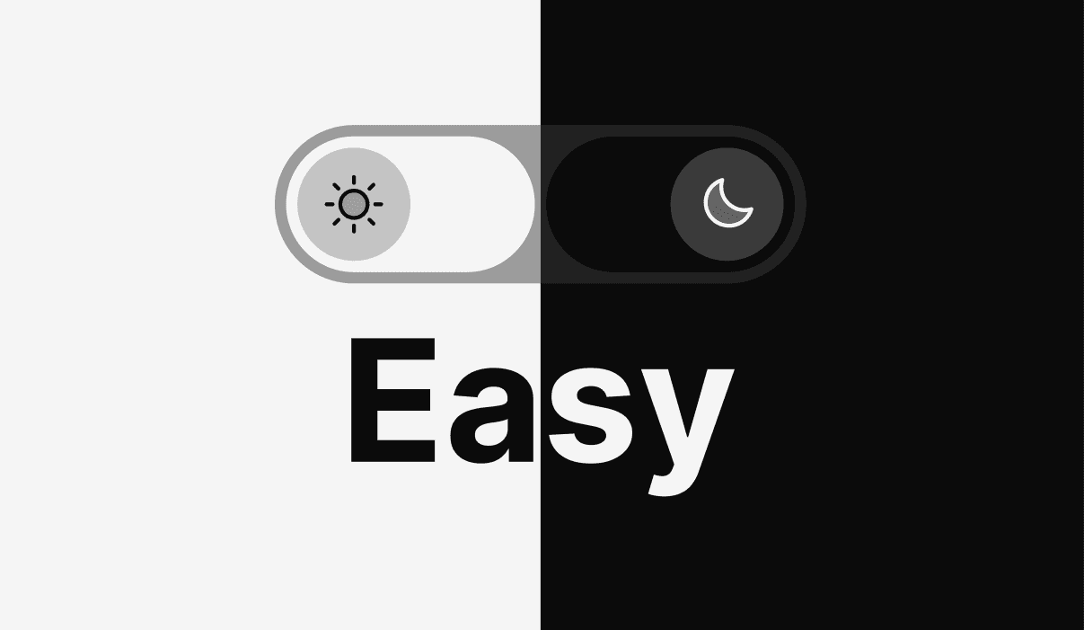
A color theme toggle button made specially for Framer by @davidkalmn.
It's highly customizable through the component properties, empowering you to set up your preferred colors and seamlessly integrate it into any of your projects.
How to use it?

01. Create the color styles in Framer
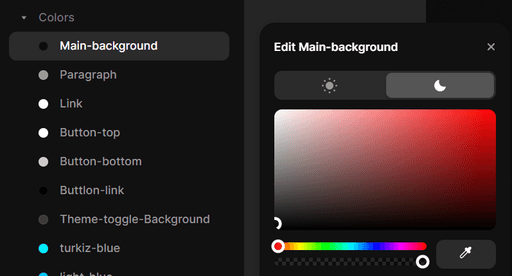
First, define your color styles in Framer under the "Assets" tab.

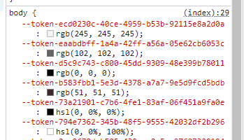
02. Find the CSS variables (tokens)
After you have created the styles, open your site in a browser and access the developer tools (F12 or right-click: Inspect). Locate your tokens under the "body" tag (as shown in the image).
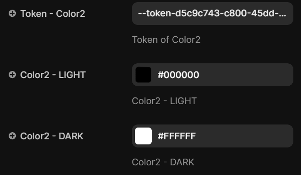
03. Pair your tokens with the right colors
Now you have to pair the tokens with the right colors in the component properties. Luckily, the tokens are in the same order as the styles created in Framer (so the first token will be the first color style's token).
04. You are good to go!
With all colors set, your Dark and Light mode toggle button is ready to enhance your Framer projects.
Just like that!
Easy
Peasy
Lemon
Squeezy
2023 © Built in Framer by

